XMCloud Sitecore Components - Visual Component builder
Sitecore XMCloud introduced a new way of creating composable components.
Sitecore Components help us to create composable components easily with less code, these components can be reused and we can able to mix and match the datasource in the component ie)
Each field in the component can get data from different sources like API, CMS, or any system which provide properly structured data.
Datasource should be in JSON format to use in the component. The XML format is not applicable at the moment.
Following options to get the datasource from different sources
- Fetch from Url (REST API)
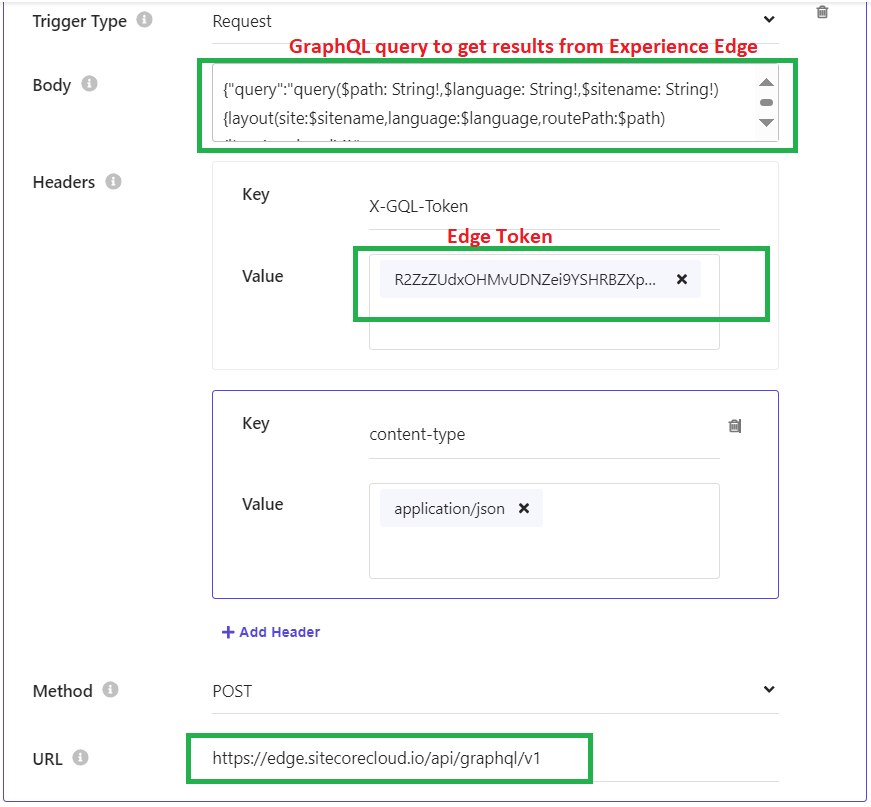
- Fetch from GraphQL
- Paste JSON (manually paste the JSON)
- Click on the Components icon from the Tools menu
- First, we need to create the datasources for our components. if we need to get data for our component from multiple sources then we need to create multiple Datasource for retrieving content from the different source systems.
- Enter Name, Description and select how we going to get the data for our component from the below options
- Once we have created the datasource, now we can configure our component with the data from these created datasources.
- Click on the Components tab
- I have created an Album datasource and it has 4 albums in it, lets us use this datasource in our component.
- Click on Add Component to create an Album component.
- We have different controls to design our components shown below
- We will use Section(two columns), Text, and Image control to design our component
- Click on Add element button to add Text control and then map the content to the datasource
- Add Image control and update necessary datasource to the Image Source field
- We can update the column layout and another setting like below.
- Styles can be also configured, I have configured the font color of the Text control to Red
- Once the component is created, Sitecore Pages utilize this component by drag-drop it into the page's placeholder.
- This component will be shown in the Sitecore Pages Components tab on the left side.
Happy Programming 😊


Comments
Post a Comment